
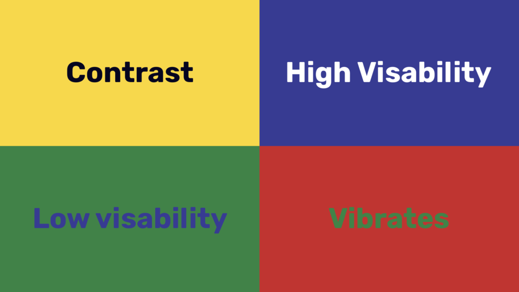
Color contrast is the difference between two colors. It’s an important aspect of web design and user experience because it can affect a website’s accessibility, usability, SEO, and marketing.
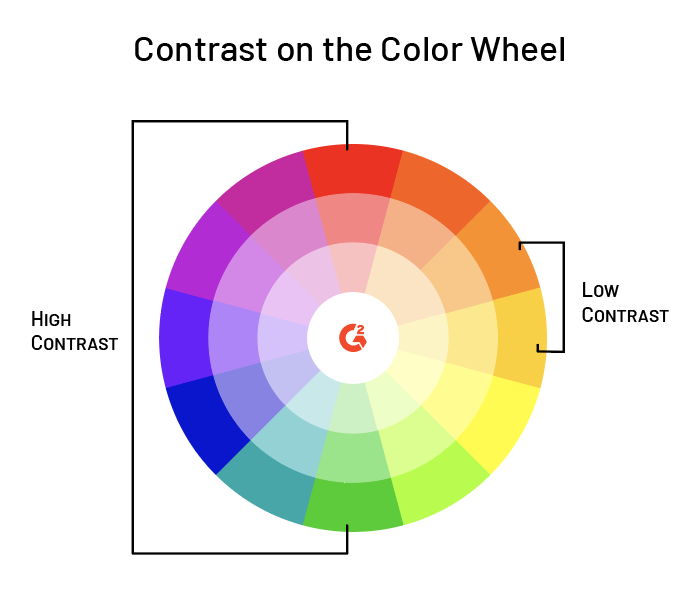
Strong color contrast is achieved when there is a high level of difference between two hues. Some designers choose to use complementary colors (the opposite sides of a color wheel), while others opt for triadic or tetradic contrasts (colors that are evenly spaced apart on the color wheel).
It’s also important to note that while blue might seem like an obvious choice for text on your site, studies have shown that it can actually be harder for people with red-green color deficiencies to read than other text colors.
What is Color Contrast?
Color contrast is the difference in luminosity between two colors. It’s important for accessibility because it helps users with visual impairments distinguish between text and its background.
To understand color contrast, you need to know what “luminosity” means. Luminosity is a measure of how bright or dark something is on a scale from 0 (black) to 100 (white).
Why Is Color Contrast Important?
For people with color blindness, color contrast can be the difference between easily seeing a red stop sign and not noticing it at all. The same is true for people with low vision who may need to see text or symbols on a screen in order to use them. Color contrast is also important for people who have dyslexia, as well as those who suffer from a variety of other disabilities (such as autism and Alzheimer’s) because being able to differentiate between different shades and hues helps them process information more effectively.
Calculating Color Contrast
The color contrast analyzer tool is a simple, reliable way to find out if your site’s colors are providing enough contrast. It uses the Web Content Accessibility Guidelines (WCAG) 2.0 AA standards, which state that large text has a minimum font size of 14px, with 18px preferred for body copy.
You can also use this calculator to check the contrast on any web designs you need help with. It’s used by designers globally and will show you how well your design meets the best industry practices when it comes to accessibility guidelines and color contrasts.
AA Standard
The AA standard is for color contrast between foreground and background, and it requires a ratio of 4.5:1. This means that the text must be able to be read against the background in at least 4.5 seconds by someone with a “narrow field of vision” who has a normal color vision. In addition to this requirement, there are also more specific requirements for large text and other situations where high contrast is necessary (such as with small fonts).
AAA Standard
When discussing contrast ratios, the AAA Standard is used. As the name suggests, it’s used by many of the world’s best-known companies when producing their products.
Contrast ratio is defined as “the relation between brightness information (luminance) and its complementary color (chrominances), expressed in decibels.” In other words, it’s a measurement of how much darker or brighter one color is compared to another.
The Contrast Ratio in human vision can be described using a number of different measurements:
- 4.5:1 = Very Poor * 7:1 = Poor * 10:1 = Fairly Good * 12.6:1 = Good * 14:1 = Excellent * 16.7:1 = Excellent
Find out how to calculate color contrast between foreground and background colors.
You can find out the color contrast between foreground and background colors by using a color contrast analyzer.
To use the Color Contrast Analyzer for your website design, follow these steps:
- First, select from three options: No problem; Minor problems; Major problems
- Then pick your two colors from a palette of two colors (one for the text, one for the background)
- Click “Analyze”
After reading this article, you should have a better understanding of how to calculate color contrast between foreground and background colors. You can use this information to ensure that your website meets accessibility standards and works for people with low vision.