
We all make mistakes. We never achieve perfection on the first try. However, becoming a better designer is about learning from your mistakes and avoiding them in the future. Let’s take a look at some common mistakes that you should avoid as a beginner UI/UX designer.
1. Look over usability
The goal of a UI/UX designer is to create an interface that is easy to use, user-friendly and enjoyable. Unfortunately, a lot of designers forget about this and put the look and their ambitions before the website’s usability. When you forget about this important factor, then no matter how cool your website looks, users will not engage with the content.
As F. Chimero said, “People ignore design that ignores people”. That’s why don’t forget to put usability first. The interface should be simple, clear, and easy to use. Make sure you know your users and adjust to their needs.
2. Cluttered design
Excessive noise and cluttered design are one of the biggest mistakes for a beginner UI/UX designer. It might seem appealing at the moment, but ultimately confuses customers and makes them look elsewhere. There are common sense design rules like having consistent elements and structured content that help reduce cognitive load.
3. Overwhelming navigation
Overwhelming navigation is one of the main reasons users might leave your webpage very quickly. People don’t want to think while they use a website: they just want the experience to be intuitive. If you make users think, even for a moment, they may lose interest and go elsewhere. Especially on mobile devices, people tend to be very impatient when searching for something, so make sure that navigation is always clear and easy on the eyes.

4. Hard-to-read fonts
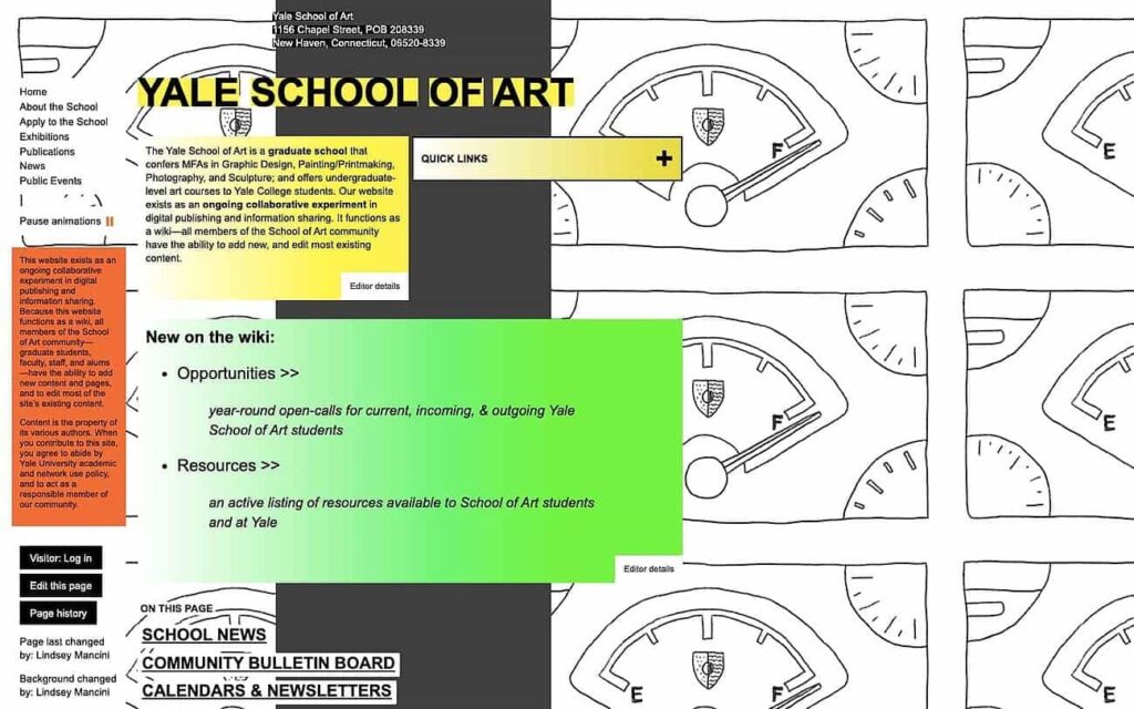
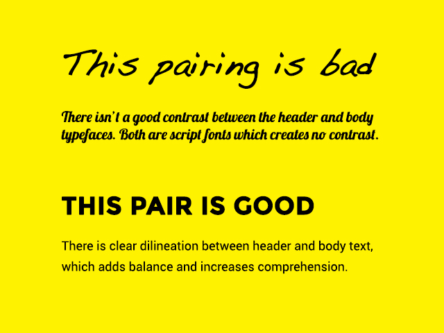
Another mistake I often see is using hard-to-read fonts. When it comes to fonts, nothing could be more important than readability. Typography actually constitutes 95% of web design. Choosing hard-to-read fonts can hinder user experience and reduce conversions by as much as 20 percent. Always optimize typography and this way you will also optimize readability, usability, and accessibility.
5. Lack of the white space
If you use too many features and text, users will feel overwhelmed. Use white space to mitigate this feeling, by allowing them to breathe and digest what they see on-screen. This applies to interactive features as well.
6. Overuse of pop-ups and other interrupting design
Avoid overuse of pop-ups, CTAs, and other forms of interruptive design. This can irritate users and decrease your site’s user experience. The Google page experience report provides an analysis of a site’s user experience on mobile devices, identifying good and bad practices. Use these insights to improve your website’s user experience and ensure that the site provides a consistent, seamless, and delightful response to the user’s actions.

Other common mistakes
- Low contrast between the text and the background. Use Contrast Checker to avoid this mistake
- No differentiation between primary and secondary buttons
- Too many custom icons unfamiliar to the user
- Small clickable areas
- Too long forms/ “zig-zag” forms
- Heavy shadows

Conclusion
Finally, all of us make mistakes but the important thing is to learn and develop to minimize them. Remember to put user experience first and then beauty and creativity will be appreciated by the users as well.