
E-Commerce websites are all about the customer experience. It’s a pretty simple idea, but it’s easier said than done. It’s easy to get lost in all of the features and functions that go into an e-Commerce site, but they can be overwhelming for your customers if not thoughtfully planned out ahead of time. When you’re designing an e-Commerce site, make sure you keep these tips in mind:
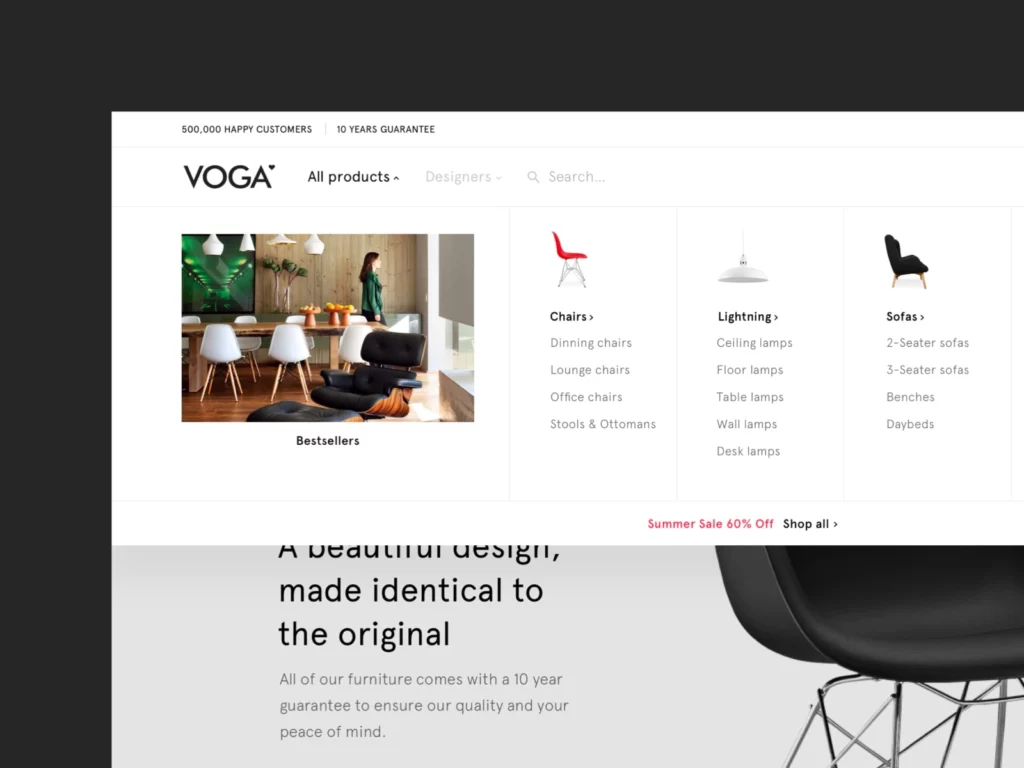
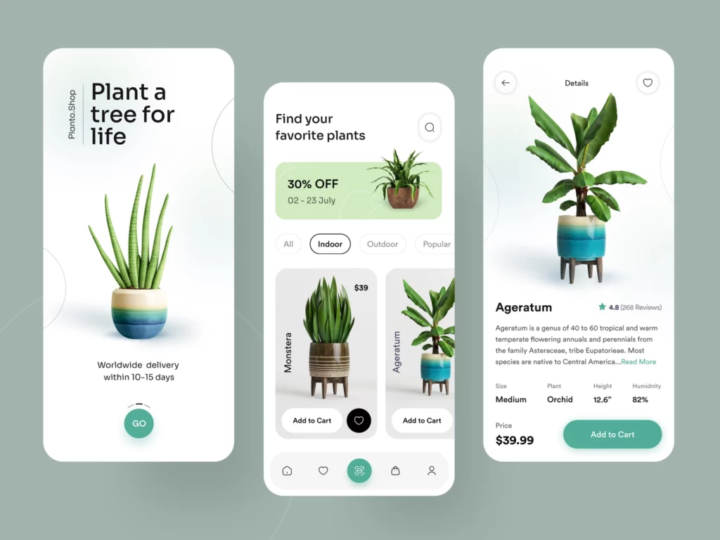
Make it easy for visitors to find exactly what they’re looking for
- Use categories and filters.
- Offer a search box.
- Show the number of results returned by a search, along with the number of products in stock.
- Let customers know whether something is in stock or not, and how long it will take for your business to ship the item after their order has been processed (shipping costs can be estimated based on this).
- Make sure that your delivery times are clear and easy to read, so customers will know exactly when they can expect their items to arrive at their homes or businesses. Returning items should also be made simple if necessary—offer an easy return policy as well as instructions on how to do so quickly and painlessly.
Create a consistent, streamlined experience
Consistency is key to a great design, and it’s easy to overlook. For example, your website’s color scheme should be consistent throughout all pages and elements of the site. The fonts used in headings and text should also be similar across the site. The way you present products on each page should be consistent with how you present them elsewhere on the website.
The same goes for other elements as well: customer service options, login screens, error messages—anything that’s visible to customers needs a consistent look and feel across all pages of your e-Commerce store
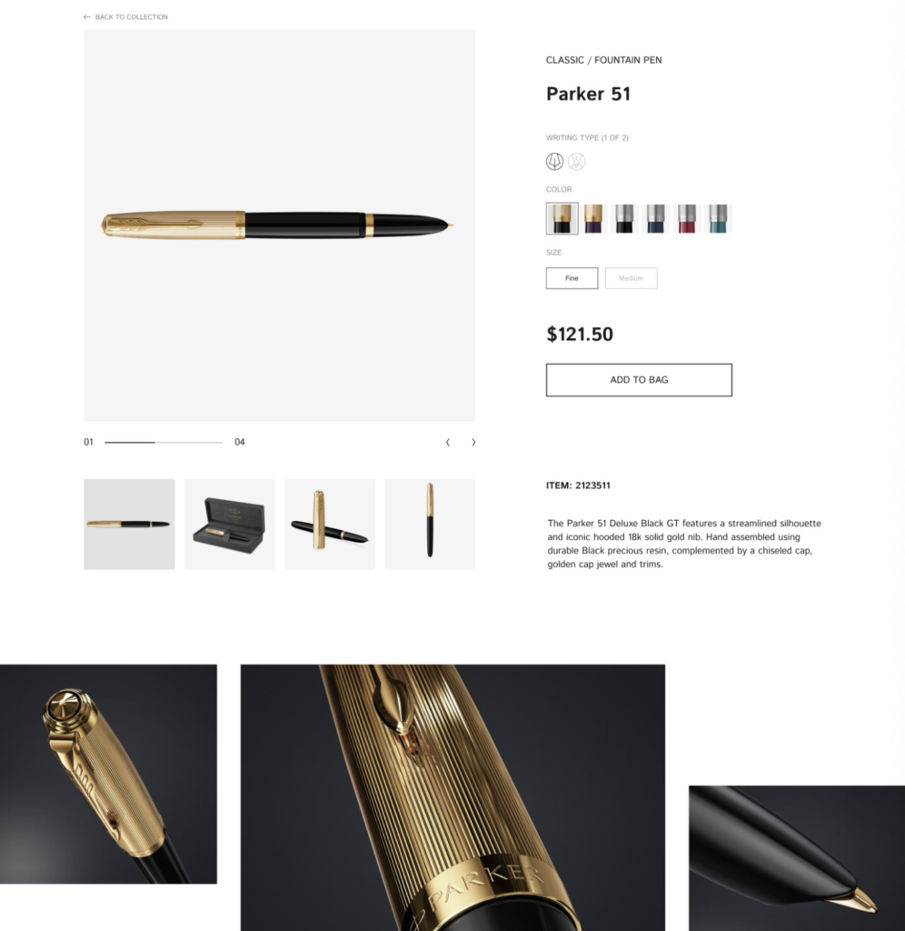
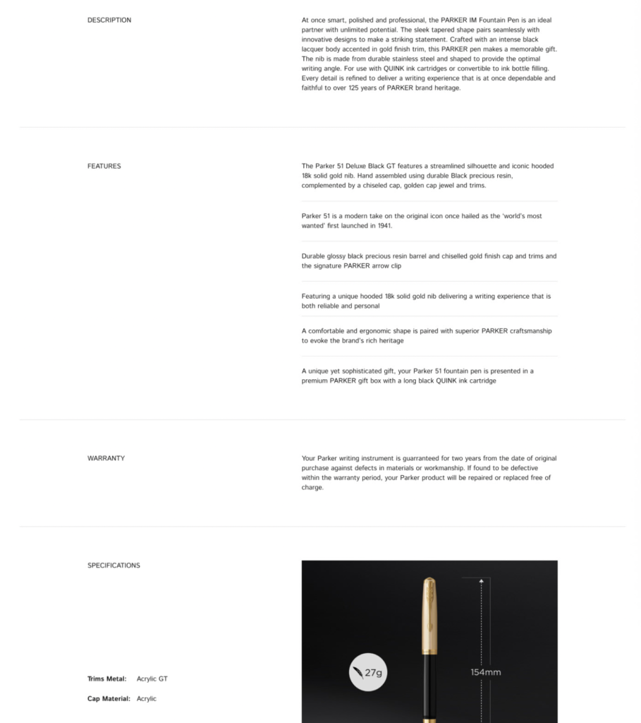
Showcase product benefits
Showcasing product benefits is one of the most important steps in creating a great e-Commerce website. The benefit of a product is what makes people want to buy it, so you need to make it clear and concise for your customers.
To showcase your product’s benefits, you can use images, videos, or text—or all three! You should choose which medium is best suited for each type of product.
- Images: If your product has a well-known advantage (like its durability), showing that advantage in an image could increase the conversion rate on your e-Commerce web page by nearly 50%. However, if you’ve got more than one feature that sets your product apart from others on the market then consider using text instead because users respond better to simple language rather than complex terms like “durability” or “sturdiness.”
Motivate the right actions
Design your website to motivate the right actions.
Your website should be easy to use, even for people who are not technically savvy. Don’t make your users click multiple times just to get through a process. Instead, use buttons and links that guide them through the process one step at a time.
Use clear, concise, and consistent language across your site so users know what you want them to do next (e.g., “add this item to cart” instead of “save”). Make sure you’re using colors that are easy on the eyes so they don’t get distracted by bright colors while trying to read content on your page or fill out forms on top of it—and don’t forget about contrast!
It’s also important that you have simple navigation so users can find their way around quickly without getting lost in too many drop-down menus where some options may be hidden between other options underneath another menu item that was clicked first before reaching there…
Design and layout are important
Design and layout are important. Your website should be simple, clean, and easy to navigate. It’s important that the design is consistent across all pages so customers can easily find their way around your website. The design should also be intuitive and user-friendly as well as responsive, visually appealing, and mobile friendly. The copy you use on your site needs to be easy to read in order for people to engage with it more easily.
Use clear, concise language
Let’s start with the basics: you need to write for your audience. This means that you should use clear and concise language, with short sentences and paragraphs. If there are too many words on any given page, users will get confused and leave the site without purchasing anything.
If your e-Commerce website is selling a service or product like web design services or web hosting packages, keep in mind that it isn’t always necessary to explain all of the details about what you’re offering—you just need to make sure that people know what they can expect from getting those services from your business.
For example, if you’re offering a free trial period for new customers who sign up for one of these products or services through an online form on your site, don’t tell them exactly how long that trial period lasts; instead, just say “free trial period” (or something similar) so people know what they’re getting into when they sign up for whatever it is that interests them most about what you offer. Again: keep things simple!
Also, keep in mind that everything from headings down through paragraphs should match each other throughout every page on an e-commerce website; otherwise, it’ll feel overly confusing when trying out different pages on one site at once (and ultimately lead visitors away).
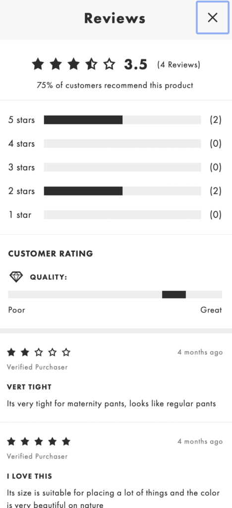
Use social proof
Social proof is a marketing concept that refers to the tendency for people to follow the actions of others. It’s used in e-commerce to increase trust and credibility.
An example of social proof is a product review section on a website, where customers have left their honest reviews about the product they’ve bought. This gives shoppers reassurance that they’re making the right decision when they click ‘buy’. You can also use social proof by displaying popular products that are related to yours on your store page as included in this article!
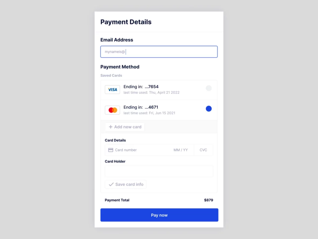
Accelerate checkout
The number of steps in your checkout process should be kept to a minimum. One or two extra steps can make the difference between getting customers to complete the order, or losing them entirely.
You should also consider using an online payment service like PayPal as opposed to handling payments yourself. This will allow you to focus on what you do best, which is selling products! Using a secure checkout service is vital for protecting both customer data and user accounts from hackers or malicious attacks by third parties who want access to their personal information.
The page where users enter their credit card details should be easy to find, and even easier for customers who have made multiple purchases on your site before (or have used other e-Commerce sites) because they will already have all their information saved there so they don’t need it, again and again, every time they make an order – this speeds up checkout times significantly without making any changes whatsoever!
Keep it engaging, but don’t overwhelm your users with content
You don’t want to overwhelm your users with too much information. They’ll lose interest and leave your site, even if they are interested in buying something from you!
- Don’t overload them with too many things to read or look at. If a user has to scroll down for 10 seconds just to find out what you’re selling, they will most likely leave your site and never come back again. Keep it simple; make sure all important information is easily accessible on the first page of your website.
- Don’t overwhelm them with too many options. If there’s an option that’s not relevant to their needs right now, keep it hidden until they’ve finished browsing through everything else (unless it’s an obvious “add-on” option like shipping costs). You can always show up-sells through secondary navigation menus later on so that people who have already looked over everything else will see more options related specifically to their needs as well!
Conclusion
That’s all for now. We hope these tips will help you make your e-Commerce site a better and more user-friendly place. If you have any questions about our work, please don’t hesitate to reach out!