If you’re a business in the digital age, you probably know that website is the best mode of communication with the customer. It’s because your brand’s website is like a digital business card. And you don’t want it to make a bad first impression, right? So to ensure that your website retains more audience, you need to follow certain principles of design.
These principles of design help the designers create a better and more user-interactive website.
You must be wondering why is that needed anyway? Let’s break it down for you real quick.
A website has become an essential part of a business, and it requires an equal amount of attention as any other element. That’s why you should be paying attention to the visual appeal of the web pages and ensure that they offer a user-friendly interface. In other cases, the visitors are likely to bounce because there are literally a million other options available.
Applying these principles of design can improve traffic, increase the percentage of lead generation, and make your brand positioning stronger.
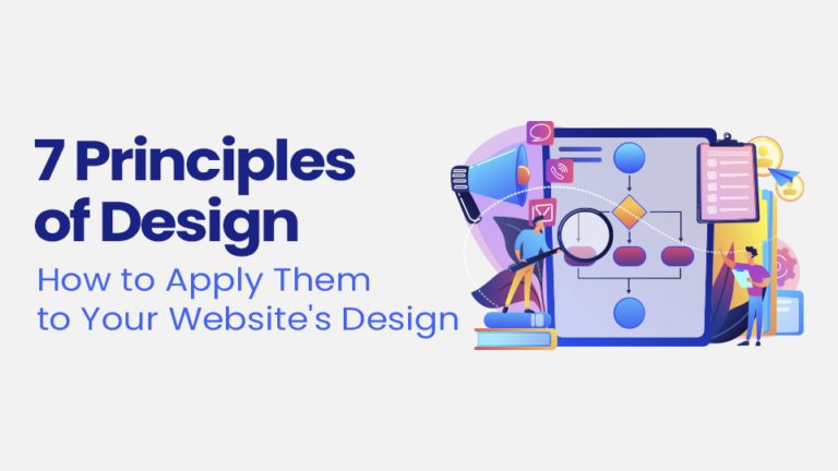
So today, we will discuss the 7 primary (yet essential) principles of design and how they can be applied to the website to make it one of your business’s best elements.
1. Balance
Balance ensures that no element overpowers the other element or creates chaos in the design. It is one of the essential principles of design that provides a visually appealing website.
Now, there are three types of balance that you can choose from.
Symmetrical Balance
Symmetry is a straight line. To achieve a symmetrical balance on your website, make sure that both sides appear as mirror images.
Radial Balance
When everything is focused around a center point, and all the objects placed are placed at equal distances, it is known as radial balance.
Asymmetrical Balance
If there is a symmetry line and both sides are not the mirror image of each other, yet both have the same visual weight and seem to be balancing each other, we say the asymmetrical balance has been achieved. This kind of design promotes modernism and vitality.
How to apply the balance to your website design?
You can apply any balance by keeping everything equally distributed on the website. Here’s an example of a website template from Pinterest to give you an example.
If you want to apply the balance to your website, we’d advise you to pick out a good website layout to ensure everything is organized. You can divide the different parts of the website into different sections and see that the content, including the images and the content, is equally divided and not merged.
However, doing this on your own can get tricky, especially if you’re not a designer. So to avoid any glitches or mishaps, we’d suggest hiring the best website design agency.
2. Contrast
If you keep all the elements of your website in one shape, color, or font, they will look mundane. To avoid an unpleasing look, there has to be a mixture of different features of effects.
This mixture of different elements to avoid that everything looks the same is known as a contrast.
Colors, shapes, negative and positive space, textures both rough and smooth can be combined to create a texture. In fact, this is one of our favorite principles of design because it can truly help you create a unique layout.
How to apply contrast to your website design?
The best way to go about it is to play around with different elements that look good with each other. Take Asana‘s website as an example.
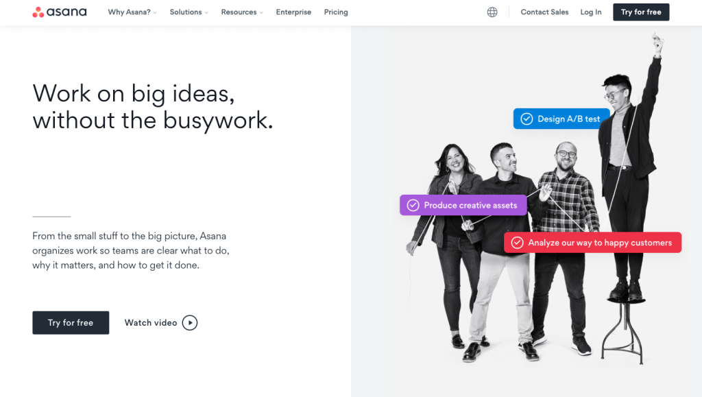
See how they’ve used contrasting colors with a black and white layout to emphasize the essential elements. This is one of the best ways to use contrast and shift your viewer’s focus to where you want them to look. This can also help captivate their attention and present your service as a solution to their problems more vividly.
3. Emphasis
There is always one element that we want the audience to pay attention to, and this is when the principle of emphasis kicks in. If you want to drive your audience’s attention towards one particular element, then you’d be using emphasis as a principle of design.
When one element becomes dominant, it can also be known as the “focal point” of the design.
How to apply emphasis to your website design?
Without a doubt, every part of the website is essential. From the design to copy and even the layout (especially the layout), everything holds importance.
However, you naturally want to attract your audience towards your selling point or your USP to increase conversion. This is where you can emphasize your Call to Action (CTAs) or a feature that best explains your website’s purpose.
Here’s another example from Pinterest of a website template to showcase how emphasis can impact a product or service.
Pro tip: you can also pair it up with contrast to create an aesthetic effect.
4. Movement
Our eyes tend to get more interested in an animated object rather than a static image.
Think of it this way – which one are you more likely to watch? A short snippet or a video or a simple photograph?
The majority would say that they’d prefer watching the video because the movement is significant to catch the audience’s attention. As it happens, it’s also one of the most important design principles.
How to apply movement to your website design?
There are so many ways that you add movement to the website design. You can add small animations or even a short yet exciting video to capture the audience’s attention. Here’s an interesting showcase of the movement principle being used in Daesk‘s website design.
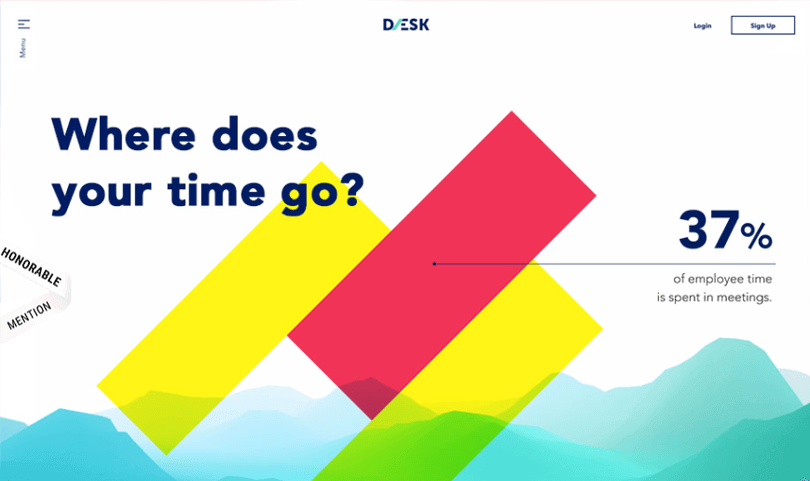
Notice how they’ve used minute features like simple lines and parallel lines to grab your attention.
Similarly, another way is to add Parallax scrolling. It is when a page is cut into different sections, and they move at different speeds. It helps to create a 3D illusion and increases the interest of the audience.
5. Repetition
How many times have you caught yourself repeating and thinking, well, that’s bad!
We’d take a guess and say countless. And while repetition is generally frowned upon in various other niches (most prominently copywriting), it is one of the essential design principles.
When a designer creates a creative piece, and a pattern is made from the piece’s repetition, it becomes very soothing to the eyes. It maintains consistency, which is considered suitable for a brand.
How to apply repetition to your website design?
Simple – you can easily create patterns by repeating some of the specific designs on your website. This can help create a unique look while also bringing the visitor’s attention to your main service or product.
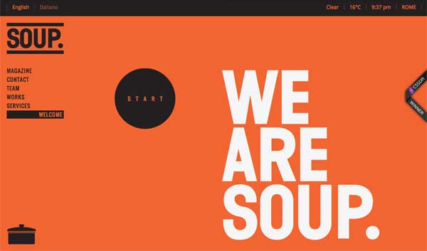
Take the example of this soup company. See how they’ve used repetition to highlight their key service? That’s what you can do as well to emphasize your key products.
But remember, excess of everything is bad. So please don’t overdo it.
6. Hierarchy
There are three elements in which anything is divided, the most important, the important, and then the least important, and everything is arranged according to it. That’s also called the rule of hierarchy in the design.
Designing things in a hierarchal manner helps your layout become more user-friendly. This way, you can prioritize the things or elements that your user wants more and make the website more interactive.
How to apply a hierarchy to your website design?
The easiest way to apply it to the website is to create a plan and see that everything is arranged according to the hierarchy depending on its importance.
Look at this example of a visual hierarchy. See how similar patterns are used in a hierarchal manner to draw more attention.
Similarly, you need to ensure that you divide the sections accordingly to your brand.
7. Unity
Unity is all about attaching the right element with the other elements to find the right balance. All the elements used are not random; instead, they all serve a purpose which is to increase your website’s interactive value.
Take a look at this template from Pinterest. See how the colors are all unified to emphasize the brand theme. Unity can majorly be used to serve this purpose; strengthening your brand image and guidelines.

How to apply unity to your website design?
Here are 3 key ways in which you can apply unity:
- Send the right message to your audience by joining the right elements and see that they complement each other.
- Add items that complement each other and are in sync.
- Also, ensure that whenever you add a new element, it complements the previous ones and does not create chaos.
Key Takeaway
The principles of design will always remain the same. However, you can still differentiate your website design or your style by using them differently.
So, whenever you are working on your website’s design, keep these elements in your mind. They will act as a guide to help you better understand and design the website.