2021 is all about reviving a lost hope and playing with joyful colors to make that happen. And this year, the logo design trends are also reflective of these notions.
Today, we will be looking at the 7 top logo design trends that will prevail in their magic in 2021. Let’s get right at it!
Stained Glass Effect
How many of you have fallen in love with the enlightening stained glass windows of earlier times?
We’d take a guess and say almost all of you, and that’s because they’re enchanting! But more importantly, they are an amalgamation of abstract and purity (provided its root in the medieval era). So it’s no surprise that in 2021, one of the leading logo design trends includes using the stained glass effect.
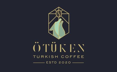
Take a look at this logo for a Turkish coffee brand. See how stained glass adds to the meaning and beauty of the logo. That’s what we’re referring to – an excellent way of bringing an aesthetic to your brand.
Simple Geometric Shapes
We all know how shapes are the building blocks of any design. However, in 2021, we’ll see a change in the use of shapes. Instead of opting for the traditional ones like squares, triangles, or circles, designers are using simple lines to create geometric shape logos.
Confused about how that might work out? Check out this amazing logo concept by Logo World Offical on Instagram.
Notice how both the logo concepts have used shapes, but the one with simple geometry and minimalism is the winner. That’s because it allows more space to breathe and is easier to follow for the customer. This makes the logo memorable for the customer, which should be the ultimate goal of any brand while logo designing.
Authentic Portraits
Do you know that the human brain naturally feels more closer or connected to a portrait? That’s because it feels more realistic and simpler to make a connection to. That’s also one reason businesses create personalities for their brand identities – to make them more personable and recognizable.
For this reason, one of the leading logo design trends in 2021 includes authentic portraits that reflect diverse faces and groups. It helps make the brand diverse and also catches the audience’s immediate connection by forming a connection.
This logo concept design perfectly encapsulates the essence of this trend.
The Revival of Symbolism
This one is my favorite because I love symbols! But that isn’t confined to me only – a lot of new logo designers love using symbols in designs because it adds depth to the brand’s meaning.
From adding a Phoenix image to ancient mountains or calligraphy, symbols have a powerful way of communication. They can also help make the logo more memorable and distinguishable, as should be the case for a logo design. That’s why it’s a top-trend that we’ll be seeing a lot of in 2021.
The ultimate purpose for using modernized symbols is to merge a classical past with a hopeful future.
Skeptical about the use of symbolism in the logo? Let us give you an example of a famous symbolism logo known worldwide – Starbucks!
Playful Color Palettes
Colors are one of the oldest but most effective ways of communication. Color theory is all about using the right color palettes to bring out the desired emotional reaction in your target audience. And this year, most brands would want to reconnect with their audience or rather let them form a connection. So for logos, playful palettes and gradients are here to stay!
The purpose of these palettes is to offer harmony and dynamic energy to the consumer interacting with the brand while at the same time differentiate from other logo renders.
Here are a few examples of color gradients to showcase their use in logo designing.
Inventive & Experimental Typography
If you want to create a text-based logo or enhance a certain word in your logo, go for the experimental typography trend. You can either use a Sans Serif font or a custom original font to enhance your logo.
In any case, experimental typography is all about playing with the normal way of lettering. However, the best way would be to pair it up with an illustration.
Here are a few examples of typography-based logos for you to get inspired by!
Balance & Symmetry
Balance is one of the basic and most essential principles for design. One of the primary reasons for that is the need for things to fall exactly in their place.
Sure, an abstract logo is aesthetic to look at, but if you notice carefully, even that is balanced properly to bring out the desired effect. So in a way, balancing and adding symmetry to the logo is a way of solidifying your brand, so it doesn’t look chaotic.
And with so much that has happened recently, this trend is going to stay in 2021!
If you’re afraid that you might end up creating a monotonous or robotic logo, don’t worry because the symmetrical design is about adding strength to your design, not necessarily making it predictable.
For instance, take a look at this logo concept to understand this better. See the creative use of colors and illustrations and how the logo looks balanced and symmetrical, further enhancing the appeal.
Final Word
Before you head out on a mission to revolutionize our rebranding your logo, remember that your logo is an essential part of your brand identity. So while it’s a great idea to incorporate modern and minimalist trends that would cater to the millennials and Gen-Z’s interest, your brand shouldn’t become what it isn’t.
Think of these logo design trends as guides to market yourself better – not change your identity altogether (unless, of course, you need a change!)