Iconography is one of the most important elements in user interface design and it is crucial for every designer to know how to maintain icons aesthetic. Icons help users to understand how different screens are connected, what actions they can perform, and what information they need to provide. To make icons more user-friendly, designers should follow some rules when creating them. We have gathered 10 best practices for icon design that will help you create beautiful interfaces that your customers will love using!
1. Keep icons simple
You’ve probably noticed that when it comes to icons, simplicity is king.
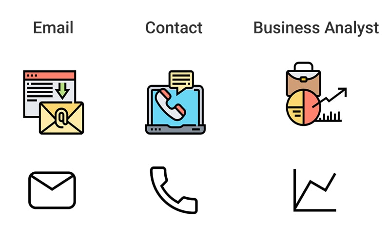
It’s important that you make sure your icons are as easy to understand and use as possible. If your icons are too complicated, users won’t know what they mean or how to interact with them. A good rule of thumb is that if an icon looks like a traffic sign or symbol, then it should be easy for the user to understand and interact with—without having to read text beside it.

Source: medium.com
2. Keep consistency
Determining the style of your icons will help your brand to remain consistent across all projects. Icons come in a variety of shapes and sizes, including filled, line, and outline icons. Stick to a specific icon style when selecting icons for your project so that it’s easy to immediately identify your brand by sight alone.
3. Specify a unique color for each group of icons
Color is a significant part of the design and should be used with discretion. The color helps to make icons more recognizable, distinguishable, legible, and memorable. Also, it makes them more attractive and more effective in communication.

4. Avoid mixing styles and colors
This is a matter of taste, but the general rule is to avoid mixing styles and colors. If you want to experiment with various styles, do it on a single icon or set of icons, not all over your project. Similarly, if you want to use different color schemes for some icons than others, go for it—but try not to mix them up too much.
If you really feel that your design needs multiple styles or color palettes in order to look good (and if it does), then make sure each style can stand on its own without looking out of place together with other styles in the same project.
5. Create scalable icons without any loss of quality
Vector graphics are the future of iconography. They’re crisp, clean, and scalable—and they look great on any size screen or in any resolution. If you’re designing icons for a website or an app, vector graphics are the way to go.
You can create vector-based icons with tools like Adobe Illustrator and Photoshop (which also include bitmap-editing tools). Or you can use dedicated vector graphics editors like Inkscape, Sketch, or Affinity Designer that have been designed for creating icons specifically.
As long as you have access to some kind of vector editing software or tool, there’s no reason not to work with vectors anymore!
6. Design icons in the right size
- The size of the icon is very important in UI design, so you should calculate it correctly.
- To calculate the right size of an icon, you need to know how much space it will occupy on a screen and what its purpose is. For example, if you want an icon to look sharp when used as a menu item and don’t have enough space for it, then you can make this item bigger than usual. If there are too many icons on one screen, then consider decreasing their dimensions (making them smaller).
7. Stay away from gradients
Gradients are the new black and white, just like in fashion: no one wants it anymore. They have been a trend for a long time now, but they don’t look as good anymore because they have become too common and too boring. The same goes for icons that use gradients: they will look dated soon!

8. Use standard icon states to make them recognizable
Icon states are the different appearances of an icon. For example, a button can have different states: normal, hover, pressed. To make your icons recognizable in any state you should use standard icon states to make them recognizable and change the appearance of only one element (e.g., changing its color).

Keep in mind: icons should be recognizable in any state so that people can understand them easily in any context.
9. Put context in the first place
The sixth rule of iconography says that when you want to use an icon, you should put context in the first place. In other words, it’s better to use icons only in a context where they’re understandable than to use them without any meaning at all.
When we talk about context, we mean the situation or conditions that surround your user and make it possible for them to understand what your icons mean, like if there is a button next to an icon or not.
Icons are best when they represent an action, like “go” or “print”. You can also use icons that represent abstract concepts such as love or hate (such as on Facebook). The important thing here is that users should know what these actions do before clicking them; if not then they might end up doing something completely different instead!
10. Design icons in separated groups
You can’t just design icons as they all look the same, you have to make sure they are easy and comfortable to use. There are many types of icons that you need to create in order to make your app or website user-friendly and attractive, but at the same time, don’t forget about the importance of designing each icon separately because not all icons look good together!
The best way to achieve this is by separating them into different groups with varying sizes for each group. This will allow people who visit your site or use your app to feel more comfortable and familiar with it because they won’t feel overwhelmed by hundreds of similar-looking icons everywhere on the pages (or screen).
Conclusion
If you want to create a great icon, you need to follow these rules. We hope that this article was helpful and that now you know how to maintain icons aesthetic in your next projects.

