
A newsletter is an opt-in email list that you can use to send your subscribers information about topics they are interested in. It’s a great way to build a community around your brand and engage with people who want more from you.
If you’ve never created a newsletter before, or if you’re looking for ways to grow your subscriber base, this article will show you how!
If you’ve ever tried to build a newsletter signup form, you know that it can be a complicated process. The good news is that we have created a list of tips to help you! Our easy-to-use tool makes it simple to set up your high-converting form in minutes.
Choose the right placement
There are two main things to keep in mind when deciding where to put your newsletter signup:
- Placement – Make sure it’s easy for people to find. Ideally, you don’t want users having to hunt for the signup button—the goal is for them to be able to sign up without even thinking about it.
- Call To Action – Make sure the call-to-action (CTA) is prominent and immediately clear what they’re signing up for. If you have multiple locations where someone can subscribe (say, a homepage and sidebar), make sure all CTAs say the same thing so there’s no confusion among readers.
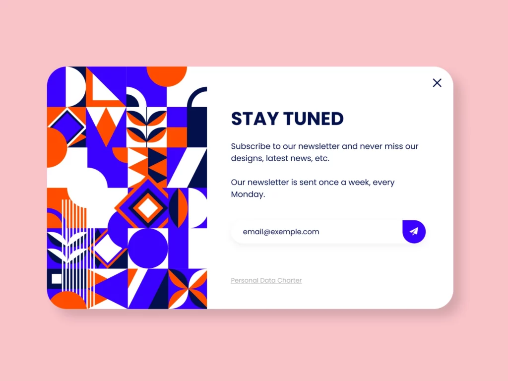
Make it easy for your audience to sign up for your newsletter.
Make sure that subscribing via email is as easy as possible by making sure that there are no extra steps involved (for example: forcing people to confirm their email address before receiving notifications). This may seem like common sense—but trust me when I say this isn’t always the case!
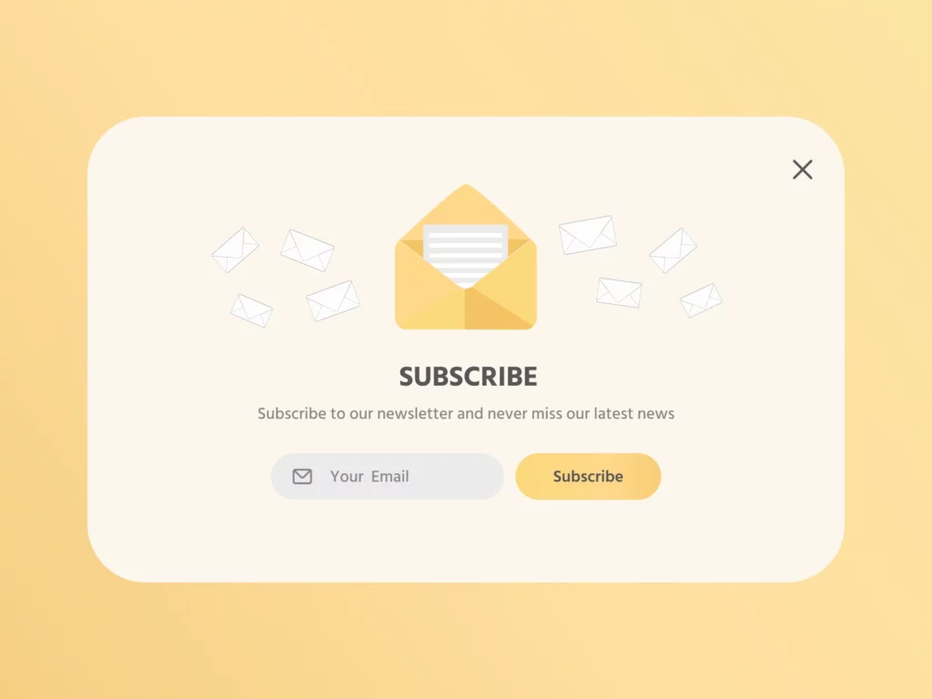
Make sure to tell users what they are signing up for
The first thing to do is give users a clear description of what they’re signing up for. Do you want them to know about your latest work? Are you trying to keep them up-to-date on industry news? Or maybe it’s something else entirely that only makes sense in the context of your brand. Whatever it is, make sure that users sign up because they want what you have.
If there’s an option for users to see what they get before they subscribe, this can also help with conversions—but make sure not to put it at the top of your list! Make sure that people are aware that this is an option if they ask or seem confused by what they signed up for (which is likely).
Add a clever and prominent CTA
A CTA is a call to action. It’s what you want your readers to do when they reach the end of your newsletter signup.
It’s important to add a CTA because it allows you to entice people into signing up for your newsletter, and this can be done in many different ways.
When it comes down, CTAs are all about being specific with what you want people to do next—so make sure that whatever you choose is relevant and aligned with the rest of your content!
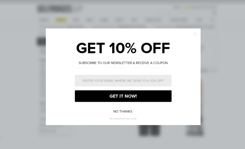
Offer your subscribers an incentive
When a user signs up for your newsletter, they’re committing to receiving updates from you. You must show them that their time and attention are appreciated by offering something in return.
Here are some ideas for incentives:
- Offer a discount or freebie when someone signs up for your newsletter. This could be 10% off their next purchase, access to exclusive content, or even just an invitation to try out one of your products before anyone else does!
- Hold competitions where users can win prizes like gift cards or t-shirts if they enter their details into the signup form. If they don’t want to take part in the competition itself, then ask them how much they would pay if they won it instead? This is often a more effective way to get higher conversion rates than just offering discounts upfront.
- Create exclusive content just for subscribers so only people who sign up will ever see it! You could also offer weekly tips about topics related to what you sell – nothing turns people off faster than reading boring sales pitches every week!
Add autocomplete feature
Auto-complete is a feature that saves you time and makes your forms more efficient. You can use it to show possible values for form fields as users type, so they don’t have to spend time scrolling through the list or typing out long phrases. This makes filling out forms faster and easier, which means you’re more likely to get better data from your subscribers (and less likely to get frustrated customers).
This technique works on single-select dropdown lists, multi-select checkboxes, radio buttons, or text fields—anything with a text input field.
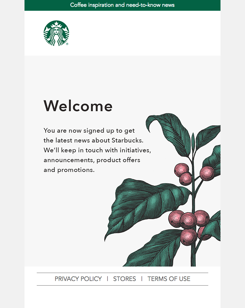
Send a welcome email
You can send your subscribers a welcome email to introduce yourself and give them an idea of what you’ll be sending in the future.
In this case, it’s important to remember that the subscribers have just signed up for your list, so they don’t know much about you or what kind of content they’ll be receiving through your emails. This makes it even more important that you make a great first impression!
A welcome email should include:
- A short message welcoming new subscribers to your email list. This is an introduction where you tell them about yourself and why their inbox will be receiving messages from you (and why those messages are important).
Conclusion
These are a few ways to make your newsletter signup more efficient. The key is to think about what you want to accomplish with the form, and then design it to make it easy for people to follow through and join your list.
Get creative with your language and design choices, so that people don’t have too many questions or objections when they’re filling out the form! And as always, test different approaches until one really stands out—and then repeat it consistently in future campaigns.