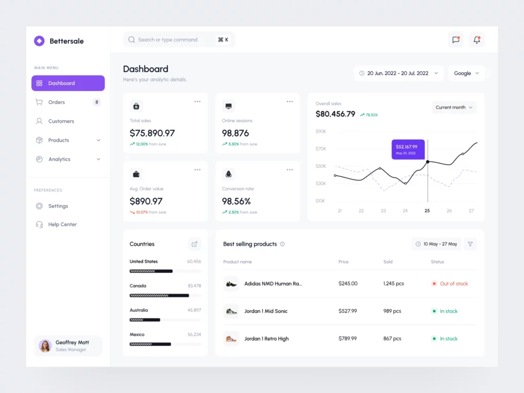
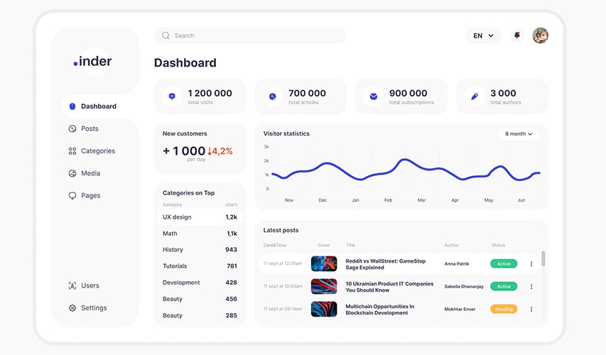
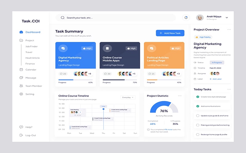
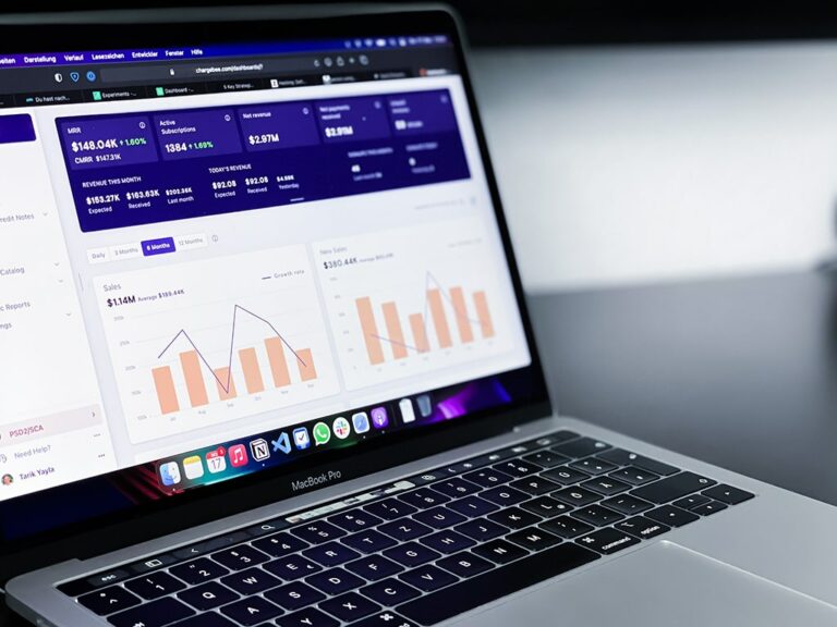
A dashboard is a visual representation of information that helps people make decisions. If you’ve ever used the Google Analytics dashboard or watched any TV show about business, then you’re already familiar with how dashboards work. But if this is your first time designing one, don’t worry—I’m going to walk you through it! We’ll start by defining what a dashboard is and how it works. Then we’ll talk about the questions you need to ask yourself before designing one, as well as some tips on how to actually design a dashboard. By the end of this post, I hope that you have a solid understanding of how dashboards work and are ready for your own design project!
What is a dashboard?
A dashboard is a visual representation of the most important information in your business. It can be a single screen or a series of screens, and it’s used to monitor and manage the performance of your business.
Dashboards are designed for busy executives who need to get their hands on critical information quickly. They make it easy to digest lots of data by organizing it by category or highlighting it in some way—for example, by color coding rows within a table.

Questions to ask before designing a dashboard
Before you start designing a dashboard, ask yourself these questions:
- What is the purpose of the dashboard?
- Who is it for?
- What is the core message of the dashboard?
- What are some key metrics that need to be monitored on a regular basis?
To answer these questions, it’s important to consider what type of data you want to display in your dashboard and what information will help support that data. For example, if you want to show how many sales were made on Friday compared with other days during each month, then your key metric might be “number of sales.” If you want to show how long it takes clients or employees to reach certain milestones within their learning journey at an online training course (like this one), then your key metric could be “time spent completing various modules within a course module.

Who are the end users of your dashboard?
It’s important to know who your end users are, and what their goals are. If you want them to use it for something specific, like sales or marketing, then it should be designed in a way that makes sense for them. A dashboard meant for finance might not have as much information on it. You need to also consider how complex is this dashboard? Will they spend 1 minute on it once per month, or 30 seconds every 10 minutes? How many other tools do they use at this time?
The more complex your dashboard is and how often someone needs access to data from multiple systems with multiple roles / permissions – the higher chances are that they will spend less time designing than using another tool (e.g., Excel).
How to design a dashboard in 4 steps
In this section, we’ll go through the four steps that you can use to create your own dashboard.
- Define the core message for your dashboard
- Create data visualizations for your dashboard
- Organize your data visualizations and filter your data
- Test and polish your dashboard

Step 1. Define the core message for your dashboard
Every dashboard has a core message. It’s the heart of what you’re trying to accomplish with your data, and it’s the reason why someone would want to look at your dashboard in the first place.
For example, if you’re designing a sales dashboard for an e-commerce company, then your core message might be “How many sales did we make this quarter?” If you’re designing a budgeting tool for finance teams at large companies, then maybe your core message should be something like “What is our current budget situation?”
Your boss may have some ideas about what he or she wants to see on his or her dashboard. The same goes for end users (AKA people who are going to be using this thing). Make sure that everyone understands exactly what information will show up on their screens when they click “save” or “publish” button in Tableau Desktop!
Step 2. Create data visualizations for your dashboard
Once you’ve identified your goals, it’s time to start designing.
Start with the data: What is the most relevant information? How do you want your dashboard to look? Will it be 1 page or 20? The answers to these questions can help guide how much detail and effort should go into each section of your dashboard.
Next, think about who will be viewing this dashboard (and what their needs are). What are their goals? Are there specific tasks they must complete every day or week? And most importantly, what kind of information would help them achieve those goals? This step is critical because without this knowledge, your design won’t serve its purpose at all!
Step 3: Organize your data visualizations and filter your data
Your dashboard should be a source of information that your users can easily access and understand, so it’s important to make sure the data visualizations are organized as well as possible. The best way to do this is by placing similar or related information together on the same screen. For example, if you are using a bar chart for sales and an area chart for profit margin, consider displaying both charts in the same window on one page instead of having two separate pages with both charts displayed in each. This will help keep your dashboard clear and easy to use while maximizing space efficiency.
When filtering through data visualizations, consider organizing them into groups based on what they are showing in order to reduce clutter and confusion within each group with similar metrics (e.g., monthly sales). While grouping together similar metrics may seem counterintuitive at first glance because it takes up more space than having everything displayed separately (and thus requires scrolling), there are several advantages:
- It’s easier for users’ eyesight since there isn’t any jumping back-and-forth between different pages whenever they want different types of information; just click once!
- When designing dashboards using tables rather than grids (as we recommend), this makes it much easier for developers who need to access specific cells without needing separate tabs open all day long just so they know where every single thing lives relative to each other.”

Step 4. Test and polish your dashboard
- Test your dashboard with users. You’ll want to test and polish your dashboard, so it can be used by all the people who need it. That means getting feedback from users on how well they understand what each part of the dashboard does, if there are any confusing parts, and if there are any areas where more information would help them do their jobs better. Ask for this type of feedback as often as possible during testing sessions—at least once per week—and don’t forget to ask them to use the dashboard!
- Review customer satisfaction metrics regularly with other members of your team, including product managers and engineers. Make sure that everyone understands why these measures were selected (e.g., because they reflect how many customers are using something), what kind of trends have been observed over time (i.e., whether things have gotten better or worse), which metrics seem less relevant than others at certain stages in development (i.e., when certain features aren’t available yet), etcetera…
Conclusion
Once you have successfully designed a dashboard, the next step is to make sure it is useful for your client or boss. If they can’t use the information presented on the dashboard to make decisions or improve their business, then it is not worth building. This article has shown some of the steps needed in order to know how to design a dashboard.


