
If you’re looking for inspiration for your website, you might be in for a big surprise! There are tons of designs and trends to choose from. And the problem is that you decide and build a website based on a specific trend; new ones start pouring in! So how do you avoid that? In two words, brutalist websites!
What’s that, you ask?
Do you remember the time when even a simple web layout used to appeal as a glorious creation? We don’t see that now, do we?
That’s because, with the ever-changing trends in the design industry, there’s no definitive trend that would surprise you. Even a minimalist website design has so much thought and a collection of trends working together.
That’s why brutalist websites have a single aim; to be so ugly and monstrous on purpose that you can’t help but appreciate and be inspired by the creative thought behind it.
But, Why Are Brutalist Website Designs So Popular?
Brutalism in website designing is a debate that has been on-going for a long while now. While some people think it is the most distasteful thing ever introduced in website designing, others support it by stamping it with creative power.
However, there is no denying that online traffic is taking up brutalist websites due to the user experience.
That’s because brutalist websites bid farewell to extremely intricate graphic illustrations and keep things simple (that’s a stretch) by their site structures simply using hand-coded HTML and old-school avant-garde illustrations.
Aside from the visual point of view in a brutalist website, they offer an improved and, quite frankly, fast user-experience. Brutalist sites have:
- Fewer interruptions
- A simple site navigation route
- Faster page loading time
10 Brutalist Websites to Inspire Your Next Web Design
While they are completely different in their objectives and design, these 10 sites below follow these brutalist art rules:
- Dark or white foundations
- Covering components
- Absence of evenness
- Congested and jumbled design
- No intricate chain of command
- Monospaced typography
- One text style utilized all through
- Simple or no animations
Time to unveil the glory now!
TwoMuch.Studio
If something common brutalist websites follow, it’s putting their object and goal out there, plain and simple.
From the first look, the TwoMuch.Studio‘s site gives us knowledge into their innovative and test world. Various vivified and intuitive animations show up on the screen, following the cursor’s route, a very stylistic and advanced route that engages the visitor.

The design of the site is fundamental yet very compelling. The website doesn’t direct the visit to a hundred different pages with rebounding linking. When you’re done admiring their state-of-the-art site structure, the site directs you to the information.
After tapping on accordions, you can get more data about projects and look into the graphical content they have on display.
2. Zermatt
If there is a site online that personifies the entirety of the brutalist standards, it’s Zermatt. It stays modern yet futuristic at the same time while engaging the visitors.
An initial landing page that shows a loading screen manages to make a certain impression on the visitor.
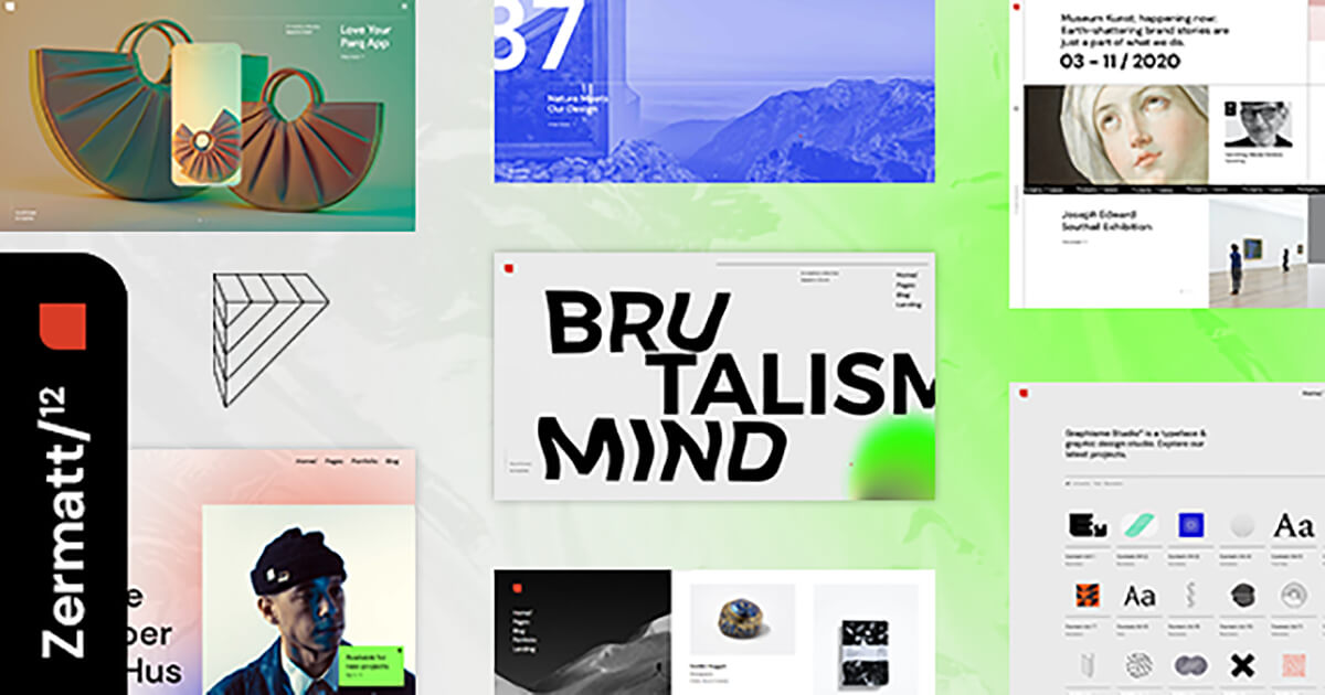
It just gives the perfect impression of no pretentiousness whatsoever and doesn’t make you click page from page to find out the site’s main goal. This site has 12 premade landing pages.
Wondering how they maintain their SEO? Simple; by improving the visitor’s site experience and being unique.
3. Candy Chiu
The majority of sites that follow the style of brutalist websites are often portfolios.
Why?
Because often, sites that act as portfolios can take away from the work they have on display by being distracting and overcompensating to it. Candy Chiu‘s portfolio site reflects the interface of a portfolio-made-into-a-site. It stays unique yet tasteful.

For instance, by clicking on “projects,” you will see Chiu’s works shown through PC windows. You can move them toward any path you like as well.
4. Cine 365 Films
Once again, a site turned into a portfolio. Cine 365 Films promotes its services by displaying its portfolio in a brutalist style. It stays unique and minimal by showing motion pictures, trailers, and data about highlights straightforwardly and effortlessly.
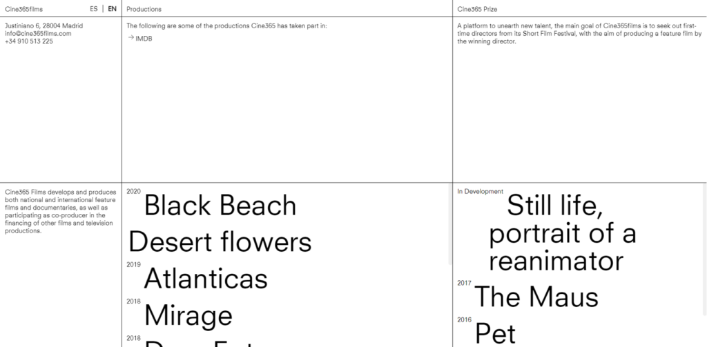
There are heaps of straight lines parting the screen into small areas that give depth and imaginative style. The most artistic part of this site is the square with the names of recorded films. When clicked, the letters become illustrated while film-related GIFs take up the whole area.
5. Folder Studio
Folder Studio‘s site also follows the brutalist art styles on linear art to perceive straightforward illusion. On the left-hand side of this site, the visitor will discover the studio’s activities’ rundown.

When the cursor hovers above them, they become shaded in red, and after clicking on them, a brief data about the picked work shows directly close to its name. The site stays simple yet cutting, which is ordinary in brutalism.
6. Allan Yu
Allan Yu uses brutalism to show the updates he makes to his site like they’re actual corrections on a piece of paper. While most designers would disagree with this technique, he fills in style with innovativeness in his site.
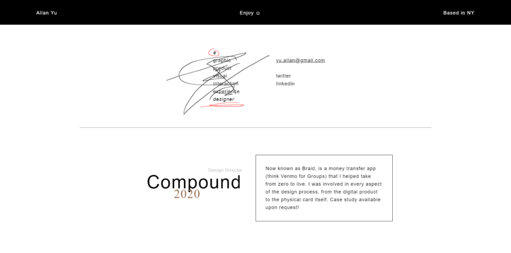
While this may upset some visitors, this art style remains unique and one of a kind in the sea of sites that look and function the same. This brutalist art style makes this site stand out.
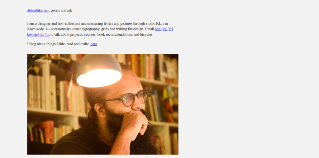
7. Keyaar
Keyaar is another example of using brutalism to your advantage. It’s a portfolio-based website, but one of the brutalist websites out there!
8. Under Consideration
Who said only portfolios could be brutalist? Under Consideration makes online forms brutalist as well. Each new section on this site is a reaction to what another creator recently composed, so the discussion between creators won’t ever end.
This gives off chain-like site navigation that stays straightforward while following the artist’s route. There are not many visuals on the site, so you need to utilize scroll bars to travel through the site.
9. Emilie Vizcano
Once again, a portfolio that stays brutalist yet informative. Emilie Vizcano’s portfolio site’s landing page is loaded up with content while looking simple and light. This sies remains distinctive by being easy to access yet seeming “plain.”
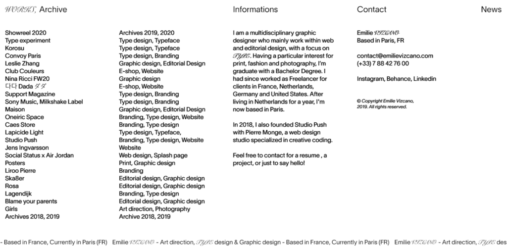
When you place the mouse on any task, its name goes to orange, the letters become italic, and a goliath picture shows up in the center of the screen. The vast majority of her works are in the brutalist style.
10. Vincent Tavano
Vincent Tavano follows the art of “follow-the cursor.” That is not its real name; however, its art style keeps visitors engaged like a cat watching fishes float on a screen. Chosen items from their assortment appear on the screen alongside a couple of reviews.
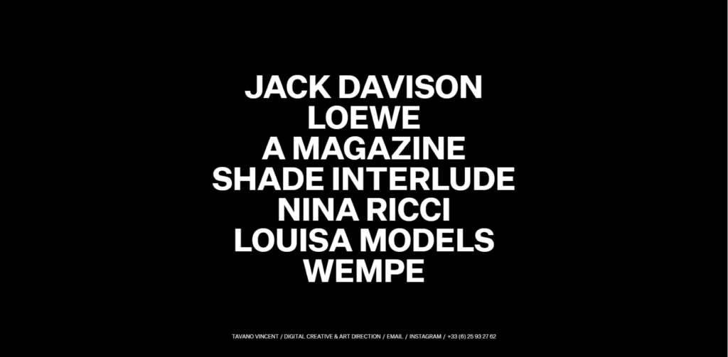
The interesting part? Pictures follow the route of the cursor, leaving a bright, permanent imprint behind. The site looks unpolished while being avant-garde. And despite its brutalist aspect, the strong imaginative features remain defined and undeniably intricate.